
The colour of your media wall affects the whole room — not just the wall itself. This guide walks you through the key decisions: dark vs light, paint vs panels, and how your room’s size, natural light and TV screen all play a part.
Quick answer
- Dark tones work well in most rooms. Charcoal, deep navy and off-black reduce reflections around the TV and help the screen look sharper.
- Light walls suit smaller or darker rooms. White, warm grey and stone tones keep the room feeling open and airy.
- Match the finish to the room, not just the wall. Your sofa, flooring and lighting all affect whether a colour reads as warm or cold.
- Panels and cladding change the rules. Textured panels add depth, so a lighter base colour can still create a strong focal point.
- Test before you commit. Get a large tester pot and live with it across different times of day before painting or ordering panels.
Why the colour decision matters more than most people expect
A media wall is rarely just a painted surface. By the time you factor in the TV, any integrated fireplace, LED lighting, shelving and the way the wall is lit at different times of day, the base colour becomes the backdrop to everything else. Get it wrong and the whole space can feel flat, cold or busy. Get it right and the room ties together naturally.
The good news is that with a few clear rules, the decision becomes much easier — and far less likely to result in an expensive repaint.
The biggest mistake homeowners make
Choosing a colour based on a small paint chip or a single photo they saved on Pinterest. Both are misleading. Paint chips are too small to show how a colour behaves in your specific light conditions. Pinterest images are often edited, shot in large studios or lit artificially. Always test at scale in your own room.
Dark vs light: which should you choose?
This is the first question most people ask, and the answer depends on two things: how much natural light your room gets, and what role you want the media wall to play in the space.
The case for dark colours
Dark tones — charcoal, slate, deep navy, off-black — have become the dominant choice for media walls, and for good reason. They absorb ambient light around the TV, which reduces screen glare and improves perceived contrast. If you watch a lot of television in the evenings, a dark wall behind the screen will almost always look better than a light one.
Dark walls also recede visually, which means a well-built media wall doesn’t dominate the room — it becomes a clean, intentional feature. With LED strip lighting or downlights, the effect in the evening can be genuinely dramatic.
The case for light colours
White, warm grey, soft beige and stone tones work well in smaller rooms or rooms with limited natural light. A light media wall keeps the space feeling open rather than closing it in. It also gives you more flexibility with the rest of the room — lighter walls pair easily with most furniture colours without clashing.
Light walls work particularly well when the media wall includes a mix of shelving, storage and panelling, as the variation in surface texture provides the visual interest rather than the colour depth.

How natural light changes everything
The same paint colour looks completely different depending on whether your room faces north, south, east or west — and at what time of day you’re most likely to be using the space.
North-facing rooms
North-facing rooms receive cooler, more diffused light throughout the day. Cool-toned greys and blues can feel cold and slightly bleak. Warmer tones — warm grey, greige, navy with warm undertones — hold up much better. If you want a dark wall, go warmer rather than colder.
South-facing rooms
South-facing rooms get strong, warm afternoon light. This means even cooler-toned colours will warm up during the day. Dark colours work particularly well here because they don’t feel oppressive — the light lifts them. Cool-toned greys and charcoals can look genuinely sophisticated.
East and west-facing rooms
East-facing rooms are bright in the morning and dimmer in the afternoon. West-facing rooms flip this. Pay attention to when you use the room most — if you mainly use it in the evening, the morning light won’t define how the wall looks in practice.
Paint, panels or a combination?
Paint is the most common choice, but it’s worth considering what panelling or cladding adds before you settle on a colour.
Plain painted media walls
A well-painted media wall in a strong colour can be incredibly effective, especially when paired with downlights or LED strip lighting. The key is getting an exceptionally smooth finish — any imperfection in the surface will be highlighted by raking light. This is why we always recommend a professional finish rather than a DIY roll.
Panelled media walls
Fluted panels, slat walls and battened panelling add texture that changes how colour reads. A mid-tone grey with vertical slat panels reads as much richer and more considered than the same grey on a flat wall. If you’re using panels, you can often get away with a slightly lighter base colour than you’d choose for a flat surface — the shadows within the panelling add the depth.
Panelling also lets you mix colours: a darker panel colour against a lighter recess, or vice versa. This works particularly well for alcove sections or areas beside the main TV recess.
Mixed finishes
Many of the media walls we build in South Yorkshire use a combination: a painted main wall section with panelled alcove sections or side columns in a coordinating tone. This approach gives you visual interest without the wall becoming too busy.
Coordinating your media wall with the rest of the room
The media wall doesn’t exist in isolation. Whatever colour you choose needs to work with your flooring, your sofa, your curtains and the other walls in the room.
A simple coordination rule
Pick one dominant tone in the room — often the sofa or the flooring — and use that as your anchor. Your media wall colour should either harmonise with it (similar tones, different depths) or provide intentional contrast (warm sofa, cool-toned wall). What rarely works is a wall that competes with several different colours at once — it tends to look accidental rather than designed.
Thinking about the TV
Most TV bezels are black. A dark wall behind a black-framed TV creates a cohesive look — the screen feels embedded in the wall rather than stuck to it. A light wall behind a dark TV tends to emphasise the frame and can make the TV look like it’s floating uncomfortably.
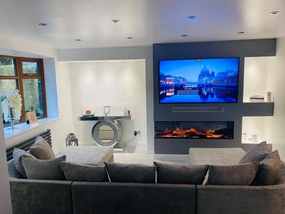
Popular media wall colours in Sheffield and South Yorkshire homes
Based on the builds we carry out across Sheffield, Doncaster, Barnsley and the wider South Yorkshire area, a few colours come up again and again — and they come up repeatedly because they genuinely work.
Charcoal and dark grey
Anthracite, charcoal and deep slate tones are the most requested media wall colours we see. They’re versatile, they suit most room styles, and they make TV screens look sharper. Popular choices include Farrow & Ball Railings, Little Greene Urbane Grey and Dulux’s Kitchen Matt range in darker shades.
Navy blue
Navy has moved from kitchens into living rooms in a big way over the last few years. Deep navy creates a dramatic feature wall without the severity of pure black. It works particularly well with warm wood tones and brass or copper hardware.
Warm off-whites and stone
For rooms that need to stay bright, warm whites and stone tones like greige and mushroom are reliable. They’re forgiving with furniture changes and they keep the space feeling fresh without being clinical. Good examples include Farrow & Ball Elephant’s Breath and Dulux Warm Cocoa.
Deep green
Bottle green and deep forest green have become more popular as homeowners look for something with more warmth than grey. Green reads as rich and considered without being as stark as very dark charcoal.
Common mistakes to avoid
- Choosing based on a phone screen. Screens add saturation. Colours always look more vivid on a phone than on a wall in real light.
- Not testing over time. Paint a large swatch — at least A3 — and check it in the morning, afternoon and evening with the lights on and off.
- Picking a colour before deciding on lighting. Downlights and LED strips dramatically change how a colour reads. Finalise your lighting plan first.
- Ignoring the ceiling. A very dark media wall with a brilliant white ceiling can look disjointed. Consider bringing the dark tone to the ceiling line or adding a gentle gradient.
FAQs
Should my media wall be a different colour to the rest of the room?
It doesn’t have to be, but it usually is. A media wall tends to work best as a feature wall — a distinct focal point. That’s easier to achieve if the colour stands out from the adjacent walls, even subtly. A common approach is to paint three walls in a light neutral and the media wall in a deeper, complementary tone.
Can I use wallpaper on a media wall?
Yes, though it requires careful planning around sockets, TV mounting points and any lighting recesses. Textured wallpapers (concrete effect, stone effect, linen) work well. Patterned wallpapers can compete with the TV — use them sparingly, or only in alcove sections rather than behind the main screen.
Will a dark media wall make my room feel smaller?
A well-built media wall in a dark colour tends not to shrink rooms in the way that painting all four walls dark does. Because the media wall is a single feature wall, the dark colour draws the eye rather than closing in the room. Good lighting — particularly LED strip lighting or well-placed downlights — helps keep the space feeling considered rather than oppressive.
What about integrated fireplaces — does the colour choice change?
Yes, slightly. The fireplace aperture and the glow of the flames will interact with the wall colour. Dark walls make the fire feel more immersive and dramatic. Light walls give a cleaner, more contemporary look. If you’re undecided on the colour, it’s worth seeing the fireplace running first — even if that means choosing colour after the build rather than before.
How many coats will I need for a dark media wall colour?
Typically three coats for a very dark colour on a newly plastered or boarded surface, using a mid-grey primer coat first. Rushing this stage is the most common cause of patchy results. This is one reason we strongly recommend using a decorator rather than DIYing the finish on a media wall — the prep and the number of coats matters significantly.
Not sure which direction to go? We can help.
Colour is one of the things we talk through with every customer before we finalise a build. If you send us a photo of your room and tell us your TV size and whether you want a fire, we’ll give you an honest steer on what tends to work well in rooms like yours — based on 20+ years of builds across Sheffield and South Yorkshire.
Or call 07477 405111 / email dan@mediawallmaster.co.uk
You can also browse our TV media wall gallery or integrated fireplace options for colour and finish inspiration.